Description:
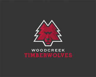
Timber Trees and Wolf Combo. Well it's unique at least ;) Thanks for the tip from Logotivity, I think it's improved.Copyright Mike Erickson and Logo Motive Designs. © 2009
Status:
Nothing set
Viewed:
13609
Share:


Lets Discuss
Pure sickness!
Replyit's cool mike, but it has a sort of dog than timber wolf(sp?) feel, what do you think? something about the nose...
ReplyI officially retire..............
ReplyClever...as always!
ReplySteve, please don't piss him off, HE'LL MAKE IT EVEN BETTER! And then we can all do what just Bart said... %3B)
ReplyClap clap clap!!
ReplyLOL guys thanks for approval:) but ya know what I think he's right it could use more of a pointy nose??
ReplyI wish I could see inside your mind :)
ReplySiah, no you really don't, I'm kinda sick %3B)
Replyholy cow! if you ever plan to do a lobotomy...call me %3B-)
Replyhaha alen! Mike's a very clever artist and he makes it look to easy... The update looks great one of my favorite from your portfolio of portfolios :D
ReplyMikeE... Back from retirement with one thought. What about moving the W into the mouth area that should help with the nose. Then you will also get the famous fangs from a wolf's mouth in there as well. Then knock it out of the park with your famous style on the eyes!
ReplyBart, ok I will be your button pusher and give her a shot %3B) Thanks for coming out of retirement. I knew you'd want some fangs.
Replywhoaah, thats powerful, Mike! well played!
ReplyNice job Mike, another solid piece
ReplyYet another flippin' great logo Mike. What if you did what Bart suggested with the 'W' and then use a 'T' for the eyes and bridge of the nose... having said that, I reckon it works brilliantly as it is.
Replydamn clever .....and sick colors :)
ReplySuper clever! Very well done! ..Cheers!
Replywow
Replypure awesomeness! :D
ReplyThanks for all the comments and suggestions.
ReplyGreat TreeWoolf, it yearns for wood as a werewolf victim %3B-) %0D*I especially like the graphical solution. Nice work! Respect %3B-))))%0D*
ReplyWhat a load of rubbish this is *cough* :(
ReplyThanks Petro and danny i guess.
Replyclap clap clap %3E fav
ReplyDamn! Seriously you are too good for you own good. Props, floats %26 favs
Replyhungry wolf
Replyawesome! :)
ReplyLove it
ReplyClever design. Well done.
ReplyImpeccable type work mate
ReplySeriously thanks guys. Hope Woodcreek likes it the same :)
ReplyIt should be a no-brainer for them really....
ReplyThanks guys, school systems are hard to change.
ReplyBummer, current Program feels this is too far from Current logo which is from a Catalog. Go figure. Committees are strange and usually afraid to try something new. Oh well.
ReplyUgh. Design-by-Committee %7C:%5B*While it sucks they scrapped this, at least they didn't ask you to make a Frankenturd out of it. At the very least, you have a nice portfolio piece (lol, like you really NEED anymore portfolio pieces). *
Reply%5EI agree.I do have too much. I'm actually going to print some Just as Timberwolves and wear them to the games. It's a local program kids in football and girl in cheer. See if people grab onto it. Sometimes they need to see stuff in action. :)
ReplyPlease login/signup to make a comment, registration is easy