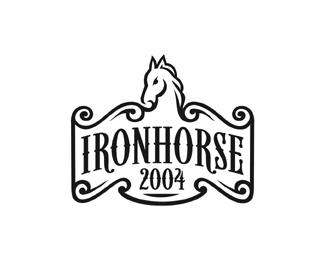
Description:
Logo I created for my font "Iron Horse" which was completed but never made it to the market.
Status:
Client work
Viewed:
8468
Share:



Lets Discuss
Kinda had the feeling it was yours before i clicked it. haha maybe cause of the smooth black lines on white backgrounds? love the horse
Replynice horse, nice font - good work
ReplyThanks Lecart and gizm0
Replyawesome font! and name!
Replywhy didn't it make it to the market, it looks like it would sell easily
ReplyThanks Sneh.*Sean, well it was done for LHF and Chuck wanted it a little %22Beefier %22 I got a little discouraged by that and have done nothing since...
ReplyBeautiful, beautiful, beautiful, type, mark n lines
ReplyThanks, Thanks, Thanks, dbunk %3B)
ReplyHello, can you change the name and number - I need a logo for a horserelated company?
Reply%5EAbsolutely, This was done just for a typeface I developed (not in use). Feel free to email me.
ReplyOr would you rather me do it here and show you first :)
ReplyPlease login/signup to make a comment, registration is easy