L'il Half Pint Logo
by LuBeraDesign • Uploaded: Jan. 25 '17
Float
(Floaters:
14 )
Description:
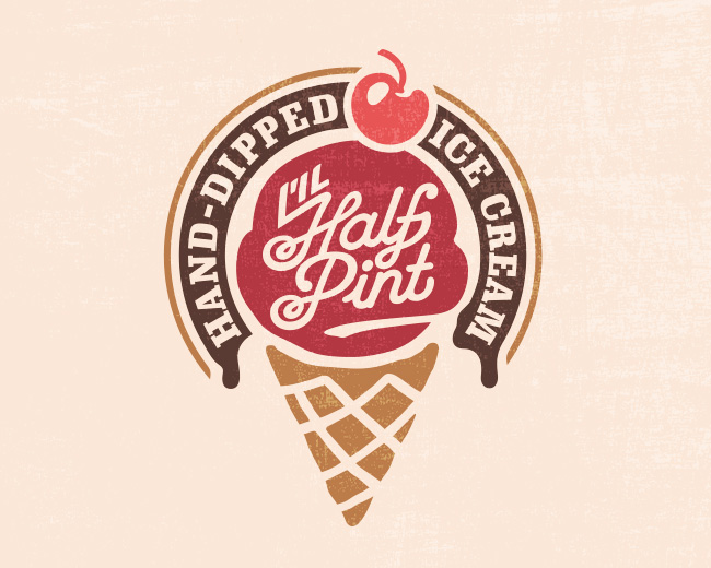
Logo and brand created for a local ice cream stand.
Status:
Work in progress
Viewed:
5,573
Tags:
•
illustration
•
vintage
•
cherry
Share:
Lets Discuss
I'm wondering does the cone need to be in there I think the ice-cream dolop is enough, the cone with all that text and banner will be hard to read small, and of course the client is going to want to use it at that size ;)
Reply@ClimaxDesigns Good feedback! My only concern with the dollop was whether it would be instantly recognizable as ice cream. Would you say that's the case? I like it standalone, which is why I included it as a secondary mark.
Replyhonestly it is hard to tell what it is as a standalone, and I like the cone, i just know clients and they WILL use the entire piece on small applications lol
ReplyI think it works with the cone, I especially like the repeating pattern with the cone. The surrounding banner adds some balance to the whole thing, but I don't know if I'm super keen on the repetition of the name? The text only is lovely too, but the "L'IL" feels a touch unrelated, but not horribly so!
Reply@kieranharrod I agree with the name repetition, it was a little redundant. I managed to switch the verbiage up a bit and I think it reads better overall. I agree on the "L'il", definitely a bit blocky, but I have yet to decide on a solution. Thanks for the feedback!
Reply@ClimaxDesigns I agree haha, I hope the secondary logo will both appease them and still be recognizable for branding reasons.
Please login/signup to make a comment, registration is easy