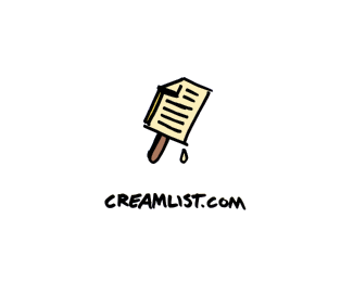
Description:
Another option.
As seen on:
Behance
Status:
Unused proposal
Viewed:
2854
Share:
Lets Discuss
cool work, mate.
Replyyea cool.
ReplyThanks! I am glad you like it!
Replylove the handdrawn style of this ...
ReplyThanks Bernd!
ReplyExcelent design, good work!
ReplyI know I'm probably gonna get bagged on here, Great concept,.. but this feels very brandstackish to me.
ReplyHa! It is kind of a wild card concept, I admit. I suppose the name was just calling for a visual pun, so we will see what the client likes. Thanks for the compliments, both of you!
ReplyThis is smart work, and communicates the concept really effectively. Love the type-only option, but this is far more entertaining and in many ways, memorable. Anytime it takes the viewer a minute to look at and comprehend a design, the more chance it has of sticking. Pretty type is nice...but the composition/concept is stronger here, imho.
ReplyThanks so much JF. Your comments are very thoughtful!
ReplyReally like this option and the type only option. The styles are quite different, so I think each would take the website in a different direction. Will be interesting to see the final choice.%0D*
ReplyThanks so much Zephyr! It looks like the project has been canceled unfortunately. Have a great weekend!
ReplyPlease login/signup to make a comment, registration is easy