Description:
Unused Concept.
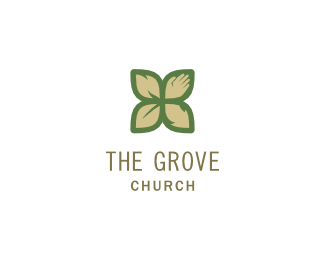
Logo Design for a church in Fayetteville, Arkansas. The brief called for a redesign of their old identity as there was new leadership who wanted to create momentum toward a new vision for the future. The target audience is a bit upscale in a community that values bike trails, farmers markets, and organic foods, but also is strongly tied to several large corporations whose headquarters are in town. The name The Grove Church was originally chosen to suggest a community who share the same source of water and support each other through deep, connected root systems. Their style is relational, casual, passionate, and Bible-based.
The icons represent their four purposes: Worship (flame), Reach (hand), Grow (leaf), and Send (arrow).
As seen on:
Behance
Status:
Unused proposal
Viewed:
5115
Share:



Lets Discuss
Very, very nice man. I love it!
ReplySuperb work!
ReplyThanks so much! Your comments mean a lot to me!
Replyvery nice , I like it
ReplyThanks! I really appreciate it.
ReplyGreat concept! Good shape! I didn't recognised the lower right shape as an arrow though. Maybe it could be a bit narrower so the arrows tip is more pronounced? The flame was hard to see too... in fact I took all for leafs, except the hand.
ReplyThanks so much for the feedback! I will definitely refine some of the shapes if this direction is chosen. Looks like the other concept http://logopond.com/gallery/detail/141814 is not going to be it. They are all meant to resemble a leaf shape to some degree, since the overall shape is a group of leaves/flower suggesting a grove, or group of plants. But I do think that you are right, the icons could be more defined. Thanks for the feedback, it is very helpful.
ReplyThe mark is therapeutic. Well done lumavine!
ReplyThanks! Really encouraging comments! Thanks for checking it out.
Replybrilliant mark !
ReplyThanks for looking! I'm so glad you like it!
ReplyPlease login/signup to make a comment, registration is easy