Description:
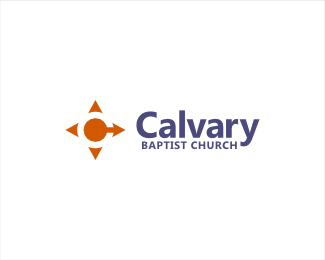
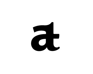
Church logo combining a C in the negative space, Compass, Arrows, and subtle cross.
Status:
Unused proposal
Viewed:
9732
Tags:
compass
•
c
•
arrow
•
cross
Share:


Lets Discuss
Nice one LumaVine!
ReplyThanks!
ReplyClever:)
ReplyThis work is similar to this I did a while http://logopond.com/gallery/detail/146297
ReplyHmmm...I immediately see the male gender symbol (circle / arrow).
Reply@logoboom: Yes I agree. It is an unused concept.
Reply@camisa15: looks great! Nice idea. Your whole portfolio is really nice.
@contrast8: thanks for your kind words!
This looks similar to the compass centre city university's logo by Crescent Lodge that was featured in michael evamy's book. http://mcocdesigned.com/Uni/DD/wp-content/uploads/2013/06/compass-centre-logo2.jpg
ReplyAhh interesting to see Compass Centere. Definitely similar. I think this one actually emphasizes the compass more. Thanks for the link!
ReplyPlease login/signup to make a comment, registration is easy