Description:
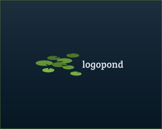
Just having some fun reimagining the logopond branding. This one focuses on the multitude of logos on the site, some floating more than others. Enjoy!
As seen on:
logopond in an alternate dimension
Status:
Work in progress
Viewed:
2882
Tags:
•
refresh
•
rebrand
•
brand
Share:



Lets Discuss
Great idea.
ReplyThanks so much Sam and Karpov!
Replynice :D what font did you use here?
ReplyThanks BuroBlauwBrug! It's Bree Serif. Lovely face.
ReplyNice floating ;)
ReplyI like the dimension view here.
ReplyOh hey thanks Tomas and Radek! It was just a quick idea, but I like the notion of lots of lillys representing all the great logos here.
Replylike this one too
ReplyThanks @ClimaxDesigns
ReplyI love how this shows depth. And the concept is awesome too!
ReplyThanks so much @itsleeboren I really appreciate your kind words.
ReplyAnytime @lumavine ! Thanks for the float on my version as well. Really appreciate it. So cool seeing all the concepts that all these different designers have come up with. Had to join in on the fun.
ReplyPlease login/signup to make a comment, registration is easy