Description:
Hello, I'm a young student who would like to launch his own website in order to exhibit his webdesign skills.
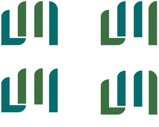
As a part of my design research, I created those logos representing my initials "LM" (actually four versions of it)
I think the colors are a bit too cold, but they fit quite well.
Actively seeking critics.
Status:
Student work
Viewed:
2237
Tags:
•
larangé
•
matthieu
•
webdesign
Share:
Lets Discuss
Honestly, I didn't know that these were the initials %22LM%22 until I read your logo description. First and foremost, a logo needs to be legible, especially if a mark isn't going to be accompanied by text. It's great that you're trying to create stylized letter forms but I think they just need to read better. As for the colors, I'm not sure what you mean when you say %22they fit quite well%22. They fit quite well with what? Personally, I think the colors are too close in tonality. If you're going to pick two colors you might as well make them stand out from one another. Hope this critique helps. Your thought process is great, you just need more refinement. Keep at it!
ReplyHello there,%0D*thanks for your critique, I admit that %22LM%22 can not been read properly...%0D*In fact, I was trying to create something abstract, but I guess a more readable logo would be better for an online CV...%0D*%0D*For the colors, I messed up my explanation... I'm quite on the rush those days, many projects to handle... %0D*I just wanted to say that they go along pretty well even though I had thought making them completely different color...%0D*%0D*That's my first logo ever so I don't really know how to begin, glad to hear that I'm on the right way %0D*%0D*Cheers
ReplyPlease login/signup to make a comment, registration is easy