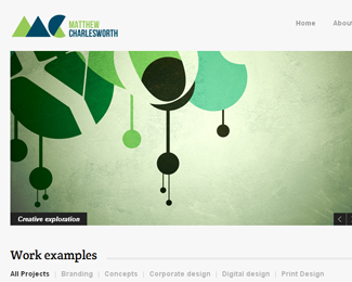

Description:
This is a logo concept for my branding as a Graphic Designer. I'd appreciate any feedback or suggestions for improvement. I'm mainly struggling to select the correct font for my name. The current font is Bebas Neue, which I like and feel that it works to a certain degree but I'm not entirely happy with it.
As seen on:
matthewcharlesworth.com
Status:
Work in progress
Viewed:
2338
Tags:
c
•
m
•
mc
•
shapes
Share:
Lets Discuss
Please login/signup to make a comment, registration is easy