Description:
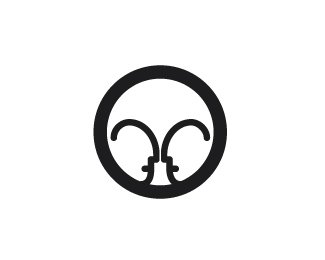
Hey guys, Here is an updated version of the "Cricket Design" logo. I made it so that the faces were too be seen first and then the cricket as i feel that is the best hierarchy for this piece. Cheers, Mason Roberts www.mmagic.net
Status:
Nothing set
Viewed:
1211
Share:
Lets Discuss
really nice too
ReplyPlease login/signup to make a comment, registration is easy