Description:
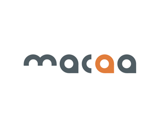
Final selected logo revision for the 2008 Biennial Conference hosted by Herron School of Art and Design. The central conference theme is Aggiornamento (uh-jawr-nuh-men-toh), which means "the act of bringing something up-to-date to meet current needs."
As seen on:
macaart.org
Status:
Nothing set
Viewed:
3022
Share:

Lets Discuss
I like it. I'm not sure why, but the spacing seems of. Those a's that are circles with triangles are also used A LOT lately, but that's not to say they should'nt be used any more.
ReplyThanks for your feedback. The spacing irregularity is due mostly to the %22c.%22 Carl Jung probably has a thing or two to say about %22group think%22 with regard to convergence in Design. That said, I created these glyphs a long while back and felt their forms responded well to the project brief and theme of the conference. So I resurrected them as one of the comps (not my favorite) for the client. Of course, the client chose this one. It's partnered with a lowercase %22mid-america college art association%22 line of copy that resides under the %22m.%22 It helps to create a beautifully long line serving as a transition into the more contemporary/compact %22macaa.%22 However, that wouldn't fit well in Logopond's rather squarish template. :)
ReplyI think you're right about it being the C. And I wouldn't mind seeing it with the text under the M. When I first saw it, my first thought was that'd be a great place for some text.
ReplyPlease login/signup to make a comment, registration is easy