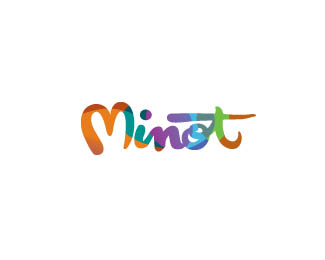
Description:
WIP.
This is for Minot's Convention and Visitors Bureau. colored version, bw version can be seen at http://logopond.com/gallery/detail/124279
Status:
Work in progress
Viewed:
2442
Share:



Lets Discuss
bw version seen here http://logopond.com/gallery/detail/124279.*Just toying with some colors and pattern direction. thoughts?
Replyreminds me of something.... oh, if I could only remember...
Replyyeah I know the technique has been used, but I thought this type was bold enough to place it within the font and give it even more excitement. Still toying with the color and texture possibilities, just thought i would see what feed back I got along this line. Client has put things on hold for a little, so i have some time. Thanks for the comment. If you find what it reminds you of let me know. I know the technique is totally new, but i haven't seen it in this type of hand script before.
ReplyPretty.
Replythanks, Jerron.
Replylike the color palette
ReplyTHX, jueves!
ReplyPlease login/signup to make a comment, registration is easy