Description:
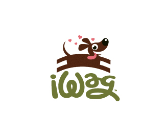
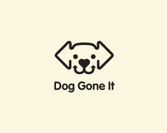
Remember this little fella? I have put his likeness to a logo (with a hand done font) for a kennel that has lots of acreage for dogs to run and be carefree.
Status:
Client work
Viewed:
10195
Share:


Lets Discuss
what ya think, does the type and fido play well together?
Replythanks for all the floats everyone.
ReplyWhoa, flew right under the radar with this one, missed it, this is great!
ReplyIt looks like the dog is jumping over the grass and I like that!
ReplyThanks, Sean and you 2, Alen. Appreciate the comments fella's. Hopefully I 'll get to work a bit on the graphic of the web site.. cheers.
ReplyGood Character*But i feel edges of the legs could be roundish .*Then it well go with typography and the character of the dog
Replythanks for the insight, Sreejith . Logo is already in use, but that is a good point.
ReplyDoggone it! This needs many more floats!
ReplyThanks, Simon. appreciate the comment.
Replylove
ReplyIts lovely Mikey!
ReplyI guess that the text part looks very big for the mark in this size, probably it should be smaller.
ReplyWow, I just don't know what to say... Thanks so much for the gallery post.*And thanks sbj, Agencija for the love. cheers. (:*serhos, I may have it displayed here a bit big.the balance was tough on this one, I wanted the name to not get lost and still play a big role in the design. I just wanted it to feel as though the dog ad name were playing together. cheers for the insight.
Replyglad you like it, Lewis. thanks for commenting.
ReplyLovely and clever!
Replythanks, Petro.
Replylovely character... just checking past designs. You have a great portfolio. :)
ReplyThanks for the kinds words, Vencel or Norbert, which ever one of the Brandingbros made the statement. :D
ReplyKidding of course, but not about the comment. Glad you like my design direction. Cheers.
Please login/signup to make a comment, registration is easy