

Description:
WIP. for a friend's blog. name may change.
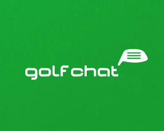
custom font along with icon.
THANKS to Bernd (Type and Signs) for the suggestion of placing the (copy) lines in place of the original second quote box. This helped give the club its sweet spot and help the quote box. THX, man.
copyright. mike bruner 6-2012.
Status:
Work in progress
Viewed:
9861
Tags:
quotes
•
talk
•
blog
•
green
Share:



Lets Discuss
I know quote bubbles have been done too hell and back, but I was just thinking the two clubs (one inside the other) was different enough to play with. Any one seen anything too close?
ReplyAlso am playing with a hand done font and trying to get the shapes to look and feel like iron club heads.
I could be wrong but, wouldn't it work with only the outermost club shaped bubble? I like the concept though!
ReplyThanks for the feed back Tabitha. I placed one up with the single club head (driver) as the quote mark and it is cleaner. But feels like something missing now, may be just me though. Feels like that sweet spot on the driver is missing. (golf talk.)
ReplyThanks for the comment.
I prefer the simple version, without the inner speech bubble. It looks like a golf club head and a speech bubble. It's simple, like me.
ReplyI definitely prefer the simple version. I think it translates well!
ReplyTanks for the feedback, Herbert. appreciate it!
ReplyThanks, Tabitha. thanks for the insight. helps. cheers.
ReplyI think it would be nice to use only the outer shape ... but ... it would be great to insert three horizontal lines ... (sometimes these "clubs" have structured areas) and these lines could symbolize spoken words ...
Replynice though, Bernd. it still lets the sweet spot show on the club face also.
ReplyTHX, man.
Made the change to the main design. Thanks to Bernd.
ReplyYou can check out the other concepts to see where its been.
brilliant. looks like a speech bubble and the grooves in the club suggest words in which you "chat"
Replysweet!
ReplyWise advice! Good job, Mike.
ReplyYup, this looks even better now Mike.
ReplyI agree guys. Thanks again Bernd.
ReplyIt weird cause now I look at it and it should have been obvious, but I looked right past it in development.
oh yes, that's what it was missing :D great job Mike!
ReplyThat nailed it. Awesome job!
Replyfantastic work here and yep! great advice from the Bman!
ReplyA lot better Mike. I was going to suggest using the lines in the club. Honest ;)
ReplyOK, now this one has been nailed. Great job!
ReplyThanks for the comments and gallery spot.
ReplyI believe ya Roy, Bernd was just faster I guess. HA! THX!
Just right Mikey!
ReplyThanks, Big Mike. Means a lot!
ReplyCongrats on the gallery spot! I love this latest revision. :)
Replynice diggin this
Replygood idea with lines inside golf club that suggests both: golf and chat.
ReplyAnd in logo design most important is? Idea. Good job :)
thanks Tabitha.
ReplyCerise appreciate the digg! :)
kWeglinski, glad you like the idea direction. appreciate that.
Cheers all.
simple effective! great job as always!
ReplyTHX GARY.
ReplyGreat concept, Mikey. Bernd's suggestion was the icing on the cake.
Replynice idea!
ReplyAgree, Kevin. took it to the next level for sure. thanks.
ReplyBelc, thanks to you also for the comments. Appreciate it!
Great work
ReplyI missed this one! love it!
ReplyAmit and Dan thanks for the comments. Appreciate \'em. cheers.
ReplyPlease login/signup to make a comment, registration is easy