Description:
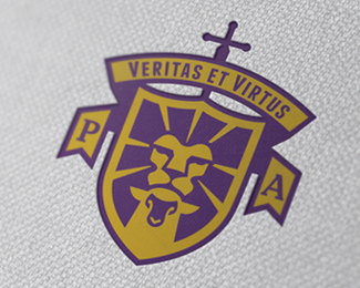
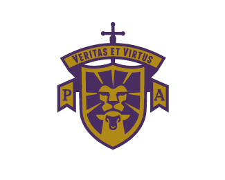
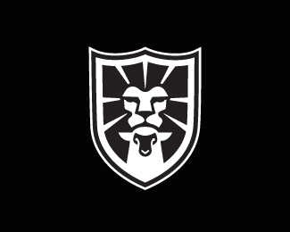
Wish I could show more as far as the final, but this is the crest only at this point for a client that is running a Christian academy.
This is the crest shown as a whole and the design shown as only a shield that will be used on clothing and other materials.
I hope people see the lions head and the lamb.
Hope you like it.
cheers.
Status:
Client work
Viewed:
15557
Tags:
•
royal
•
academy
•
religious
Share:
Lets Discuss
Pretty amazing work here. I love the complementary intersection of light and dark between the lion and the lamb. Really clever.
ReplyBernd and Sam thanks for the nice feedback, appreciate it!
ReplyHope to post with the complete name soon.
Cheers.
Great man!
ReplyThanks, Kevin.
ReplyLooks great!
Replyappreciate that, Antonio! THX.
ReplyExcellent job Mike.
ReplyTHX, JP! :)
ReplyNo idea why I didn't float this the first time i saw it. Great stuff Mike.
Reply:) glad you like it, Dan.
ReplyGreate! One more powerfull and MEGAstrong logo!
ReplyMike this is simply stunning.
ReplyAnd why its not in the Gallery is baffling. You must have used up your quota! :)
ReplyHA! Paul, right!
ReplyI guess I can add the type to it one of these days, because they finally have the site up and running. they ask me not to place the whole name up until they launched. Will do that soon. thanks, bud.
The stacking of the lion and lamb and the merging of the two is seamless. You are the man Mike ain't no doubt about it!
ReplyNice. Reminds me of this: http://logopond.com/gallery/detail/82318 ;)
ReplyTHX again, Paul.
ReplyGareth... :) yeah a few lion and lambs out there.
here's another one I did. http://logopond.com/gallery/detail/165836
ReplyGorgeus!
ReplyTHX Tanja!
ReplyPlease login/signup to make a comment, registration is easy