
Description:
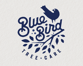
Logo WIP for a friend of mine that is a arborist. This is one of a couple I am presenting, but I think this is the strongest so hope he choses it.
Status:
Work in progress
Viewed:
14902
Tags:
garden
•
organic
•
arborist
•
branches
Share:


Lets Discuss
so rad!
ReplySuper!
ReplyPerfectly executed
ReplyThank you Bojan, Sam and Mario, really appreciate the kind words.
ReplyAnd a big THANKS to whomever place this into the gallery.
Cheers.
Killer Mikey
ReplyIs it necessary to bend the name, Mikey?
Replysuch a Beauty !!!
ReplyI am with Nikita - something feels strange regarding bending script letters (especially with capital B) Mikey... even though you almost made it work :) clap, clap :)
Replywdkjfskdfsklvdlskvnldknsldknvdlvnldkfnvdlf :o
ReplyLovely work!
ReplyNikita and Bojan, I placed another sample of the design without the curved type. I guess when I was reviewing the two, the curved type gave the design a little more character and uniqueness to the overall design for me. check it and see.
Replycamisa15 and mistershot thanks or the comments.
It looks good to me! It would be super cool if you make it a bit lighter as you posted on dribbble.
ReplyWhat a beauty Mike! I think your client would be blown away by this. Its great to see the 'Unilever' style executed differently. It just makes sense and not forced in this regard.
ReplyWith the curve, I don't mind it. Like Bojan said, you pretty much pulled it off. But I would lessen the curve to keep that uniqueness. Well done mate!
super !
ReplyOne of my faves from you Mike.
ReplyNikita and Norm really love the feed back and I am trying different options, at this point I need to meet again with the client and see how this baby comes together. Thanks guys. I'm close I believe.
ReplyRedStar, thx.
Rudy, nice to hear. thanks, man.
Very Nice...cheers
ReplyClever negative space!
ReplyChris, tycoone and palattecorner thanks for the comments. Appreciate them. cheers!
Replylove
ReplyTHANKS Glen!
Replynice mark
ReplyHey Mike - check this out -
Replywww.behance.net/gallery/30358457/logo-Bluebird-Tree-Care
blah...
ReplyMike and Bernd, I went to that link but it says that page cannot be found, did they deleted it because it was a plagiarism? and who deletes the pages in Behance, the site itself?
ReplyI wish I saw the page myself.
Hi Rudy, massive pressure I thing - three projects - as far as I realized all stolen logos. Hope you are fine !
ReplyHey Bernd, I figured once I couldn't find the page anymore, why do people keep doing that is beyond me but I'm glad we have each other to keep an eye on things.
ReplyI'm doing well thanks, working on long projects though and takes time away from other things, I hope you guys are doing well and busy as always.
Bernd, Bojan and Rudy sorry I missed your comments.
ReplyBut as Bernd mentioned already it was pressure from a few different designers that made it come down.
Bernd< I saw your post on the site just before it came down, so BIG thanks bud.
Rudy, I so agree with you on the fact that it does take a group of us designers to keep a watchful eye out for these low lifes that keep ripping of us designers.
Lets keep it up and all have a watchful eye.
Thanks for all the peeps that let me know this was up.
I know there were a few other designers that mentioned the same guy had some of their designs up also and I beleive they are down too.
nice job. cheers all.
Please login/signup to make a comment, registration is easy