Description:
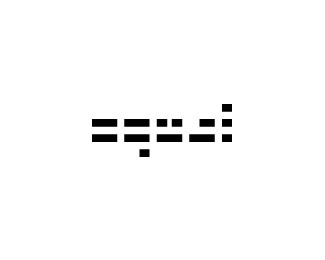
I've been working on a "JK" ambigram as a personal logo, and this it the best I've managed to produce so far. Let me know how you feel. Is is legible? (Sometimes the K looks like an F to me...)
Status:
Nothing set
Viewed:
4829
Share:


Lets Discuss
lefty is right the mark is strong but I'm not identifying letters.
ReplySince you are looking for critiques. I'd work on the leg of the k maybe try slanting the smaller mark. I believe it will hold up as a dot on the j slanted. Of the two marks, IMO this one is more interesting. The other one is a classic monogram and it is more likely that it already exists or something like it.
ReplyPlease login/signup to make a comment, registration is easy