Float
(Floaters:
1 )
Description:
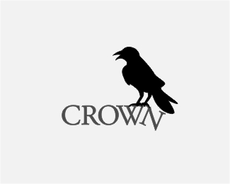
crown minus the "n" is crow. just exploring the concept:)
Status:
Nothing set
Viewed:
2200
Share:


Lets Discuss
Really love this, though I'd move the N down more so it looks more like it's actually falling. I love the crow, and I like that it's not just a crown thrown on top. It makes the name Crown more memorable to have the crow there.**Right now it looks a bit like it's just crooked. No one else will probably notice this, but the font looks a lot like the Crown College font, which is a Bible College in Tennessee. Though any font similar will make me think of the school, lol. I went to the church affiliated with it for several years and saw it hundreds of times a week.
Reply*The crookedness is just an illusion created by the tilted %22N%22. Appreciate your comments:)*
ReplyI agree with Mr. M that you need to drop the N down. Do that and it would be great. Even better would be a crow holding a crown up and pecking it. How good at drawing are you?
ReplyI have to disagree on the addition of the crown, that seems almost too obvious and takes away the charm of the crow, but what about making the crow silhouette the same color as the text?
Reply%25thanks for the comments:) I'm still in the process of exploring on improving this logo. I will be posting revisions soon:)%25
ReplyPlease login/signup to make a comment, registration is easy