Description:
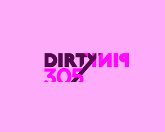
a logo for the Dirty Pink collective...the top 305 visual / performing artists in Miami...
Status:
Nothing set
Viewed:
1431
Share:





Lets Discuss
Really interesting. Readability is a small issue though.
Replyugh I know! I want the K and Y to work... i hoped the colors would push the readability a bit... more implied. Still working :)
ReplyI really think it works fine. I read it at a glance and wanted to know more..*My only hangup is how the black tail cuts into the 5. I think that's a little more of a concern. Maybe don%3Bt have it come out the bottom?
ReplyI will take your suggestion cobaltcow thank you! :)
Replyhttp://logopond.com/members/profile/showcase/58465
ReplyPlease login/signup to make a comment, registration is easy