Description:
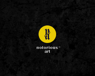
Gothic art related showroom...tee, rings, posters.
As seen on:
www.maskon.net
Status:
Client work
Viewed:
7983
Tags:
art
•
gothic
•
logo
Share:
Lets Discuss
i'm diggin' it.
ReplyI really like it
ReplyNice mark. Have you tried the type in one line with no letterspacing?
Replythe type follows the flow of the mark...to create the same structure, i have placed the type in 2 lines...:)
ReplyFair enough.
ReplyNice mark.
ReplyI'd add some more spacing between the two lines of type since there is so much spacing between each of the letters. Might be worth trying.
ReplyVery cool mark, by the way.
ReplyBeautiful monogram! %3E Type tracking seems a bit loose? But the mark's awesome! :)
Replyi tried that ocolarlnk...the type jus goes everywhere...thx for the insight..:D appreciate.
ReplyNice work, it's looking good!
Replythx bud...:)
Replyupdated.**ver 2 http://logopond.com/gallery/detail/92354
ReplyVery subtle and professional! I also like the purple and gold color scheme.
Replyya notorious art
Replyfinally in the gallery. Good work!
Replymatt, antyclymax...lonradk...thx buds..:) cherz!!
Replyfantastic!
Replyyo gary..thx dude...:D
ReplyPlease login/signup to make a comment, registration is easy