Description:
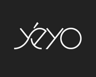
logotype for a new premium tequila.
As seen on:
Status:
Client work
Viewed:
3836
Share:


Lets Discuss
Dig it! You tried connecting the e and second y?
Replymattkump, yes that was in one of the early designs, but it was removed for readability and also to align with the brand image: %22smooth and crisp.%22 Thanks for the comment! :)
ReplyPlease login/signup to make a comment, registration is easy