Description:
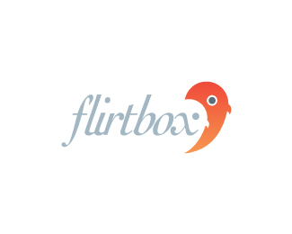
Unused Concept : Flirtbox is an online social community. Inspiration - love birds
Status:
Unused proposal
Viewed:
16864
Share:
Lets Discuss
Yeah, that's interesting. maybe drop the ligature on the bird's eye?
ReplyAh, finally...thanks, guys!!**Roy, that's a great idea. Definitely going to try that.
ReplyUpdate. :-)
ReplyCool, are the beaks and bird colour accurate?
ReplyI agree, best so far, really good.
ReplyThanks, guys. I'm going to leave the beak alone. There is usually a little more contrast between beak and body, but I like it this way. Keeps it a little more simple.**@ Climax : That's kind of the point. I wanted the font to feel somewhat flirtatious...if you will. I like it. :-)
ReplyVery nice piece!
ReplyThanks, guys!! Too bad the client thinks otherwise.
Replyhey Kevin.. hows it going bud.. clients huh.. haha.. but to be honest i couldnt get passed seeing a shocked orange dolphin!... so what directions the client taking?
ReplyGreat, man!! You? Funny you say that. He saw a shark. So far, none of these directions are up to par. Still going through the back and forth process. But I don't give up easily!! :-)
Reply@ nima : Thanks again.**@ clash : Thanks, dude. The x/eye credit goes to Roy. He's one smart logo designer. :-)
ReplyFor some reason I'm seeing a stylised Montgomery Burns, I do see the love birds but not straight away unfortunately! I'm not digging the type at all, its like the spacing is widening from left to right because the flirt text is quite cramped as opposed to the box text. That's due to font choice and I'd go with something different. In general I don't think its really working in terms of what its supposed to represent. IMHO.
ReplyThanks, TT. Good points.
ReplyWhy was listed this logo on the first page of logopond.com?... IMHO it doesn't worth it. Why? Because it fails in transmitting a well-founded message. That bird is not a bird...
ReplyThey are love birds. Do a google search. Perhaps I should add in some greens towards the bottom of the bird?
Replyhey OI, nice work but thought I'd add some comments too.**1. I had to look at it for 20 seconds before i saw the 2 birds. Like a few others I see the scred orange bird (looking top left).**2. Theres something about the kerning that I think seems off. I'm thinking it%3Bs the flir looking a lot tighter than the tbox. Maybe slightly more spacing between the l%26i%26r - to match the f%26l spacing?**3. Orange bird seems slightly stoned with the large pupil.**4. The grey text seems a little pale against the strong orange. I think i'd maybe try another 10%25 blacker?**Geez - all of that seems as though I don't like it.
ReplyYes, i have to agree that the kerning seem like a bit too tight and the color of the text make it more darker.
ReplyThanks for all the helpful feedback. I definitely agree about the kerning. It is off. I'll try and revisit this soon. Thanks again!!
Replyvery cute... i love it.
ReplyThanks shin!
ReplyPlease login/signup to make a comment, registration is easy