Float
(Floaters:
64 )
Description:
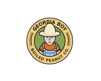
Final logo design for Georgia Boy Boiled Peanut Company.
Status:
Client work
Viewed:
10357
Share:



Lets Discuss
this is fantastic mate!... absolutely brilliant!... instant classic look!
ReplyNice illustration, well done!
ReplyWOW!!!! Love the peanut head hat Oc. Awesome!
ReplyI like it... nice illustraction... good work
ReplyYou could really push it and make the head/hat shape a little more peanutish...and maybe some dimples on the hat too! Nice regardless.
ReplyThanks for all the feedback, guys. I was getting tired of looking at it. Glen, that's a great idea. Especially the dimples on the hat. That might be all I need. And to be perfectly honest, Bart, I hadn't even noticed the peanut shape. Happy mistake. :-) Thanks again.
ReplyThe execution on this one is great Kevin, really well done. I find the character a tiny tiny bit mean looking though.
Reply%22I hadn't even noticed the peanut shape. Happy mistake.%22**Really?.. i thought that was intentional it was so obvious!
ReplyThanks Robert, David, Nav, and Nima.**Interesting perspective about the face, David. Nav, ya know, somebody really loves me upstairs. Many of my logos have done the same sort of thing. It's kind of like my logos are smarter than me. I dunno. I don't really get it.
Replymust be the swamp monster %3B)
ReplyGreat style Oc! I think you could improve the face by trying to make eyes nose and mouth the same width. And maybe move the mouth up a little, it seems to be too close to the chin. Love this anyway.
ReplyWell done Ocular... I agree with Art about chin / chin* :-)
ReplyBeautiful logo Oc'.
ReplyReminds me a bit of Chris Ware's style. Lovely. Added to my fav's!
ReplyThanks again, everyone!! I appreciate all the constructive feedback.
Replydang, ho'wd I miss this one? musta been when I was inactive. Impressive bro. I Mikee likee
ReplyThanks ME.
Replygreat illustration
ReplyThanks Konrad.
ReplyNice work, love the simple style :)
ReplyThanks man!!!
Replynice style here
ReplyThanks again, Capota.
Replythis is very good ... like it !!
ReplyPlease login/signup to make a comment, registration is easy