Description:
Working on a logo and brand name for my brother and his friend's new business. They will provide "handyman" services.
Status:
Unused proposal
Viewed:
7280
Share:
Lets Discuss
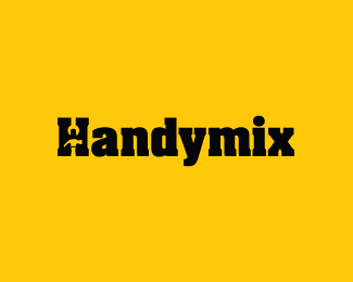
I almost see a handyman formed by the two tools. A squared head and the arms (and the belt too) formed by the hammer.Like it!
ReplyColours, font and everything is nice... But I think the two images that cut into the 'H' are conflicting... Perhaps either just choose one of those objects and have them symmetrical OR just have one cutting into it and the other half just a normal 'H'. Good work! :)
Reply@logotomy - Thanks for your feedback, Olivier. I'm going to explore the %22handyman%22 idea further. :-)**@Mason Roberts - Great feedback, Mason. I will try another version of this. I'm thinking about keeping the top portion of the 'H' %22normal%22 and applying the wrench in the negative space of the 'Y' or 'X'. That might achieve a better balance.**@Houston-we - I wanted to explore logotypes for this particular brand. But I will be sure to try your idea out. Thanks, Dalius!
Replyi can see a wrench be a perfect %22i%22 with the negative space of the wrench be a perfect dot. but i know that probably wouldn't be a good focal point for the type.%0D*%0D*what about a hammer hitting a nail to help form the %22H%22? that way it helps display an actual handy man action.
ReplyCan't wait dude! :)
ReplyReally nice solution for the H. Is there something on y and x i cannot realise that for sure at this size? :)
ReplyMind-blowing negative space solution!*Fantastic!
ReplyPlease login/signup to make a comment, registration is easy