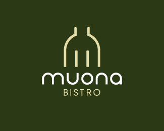
Description:
A modern and upscale bistro. The mark represents a fork, the letter M, and the top half of a wine bottle.
As seen on:
For Sale
Status:
Unused proposal
Viewed:
11937
Share:
Lets Discuss
Awesome dude! love it!
ReplyThanks Dima. I really like what you did with your personal logo mark. Nice monogram.
ReplyBut it is aligned with the bottle, Doug. %3B-) Your eyes must be playing tricks on ya'! Thanks for your kind remark, dude.
ReplyNice Kevin. Not to be too picky, I think Doug may have a point. The O could move right a gnats whisker. :D
ReplyLOL. Cheers, bud!
ReplyGreat composition, Kevin.
ReplyThanks Roy. I think you were chiming in as I made my last comment to Doug. Thanks for the feedback. I think you are right about the 'O'. :-D**And thanks Sean. I appreciate you taking the time to comment.**Have a great rest of the day, fellas!!
ReplySmart Kev, ya know might try a version that has the base of the bottle underneath Bistro act as the B? this would make the fork M and Bistro B. An M B combo if that makes sense? I Like this and sure your clients do also.
Replybravo bravo
ReplyClever. Good font choice too.
ReplyVery nice! I like it Kevin
Reply@logomotive - Thanks Mike. That's a great idea!*@penflare - Thanks Sean.*@sdijock - Thanks Steve.*@jenlogo - Thanks Jen.**And thanks to everyone for the floats.
ReplyYeah, mine was the first Kevin, don't forget that!! LOL, just kidding, splendid logo you got yourself there buddy! :)
ReplyYours certainly was, Alen. You don't miss a beat, do you?! :-)
ReplyVery cool:)
Replyreally like this and the face aswell, really love simple logo executions like this... hop one two into my favs... well done!!
ReplyThanks Fabian, Paul, and Randall.
ReplyDude - thats awesome. Really well balanced.*Love the way the fork is immediately visible - then the bottle comes into view a touch later... (for me anyway)
ReplyI'd eat there :)
Reply@wo0f Thanks Bruce! Glad you see it that way.*@Hayes Image Me too! :-D
ReplyNice one Kevin :) Is this on IncSpring?
ReplySimple and amazing.*%3Ca href%3D%22http://wholebodyvibrationtherapy.net/%22 style%3D%22overflow: hidden%3B text-decoration: none%3B width: 50px%3B background-color: %23FFFFFF%3B display: block%3B float: left%3B text-indent: 1000px%3B white-space: nowrap%3B%22%3EVibration Traning, Vibration Platform, Vibration Therapy, Power Plate%3C/a%3E
ReplyThanks Jenny. No, not yet. Perhaps I'll add it. Thanks Clint, glad you like it. :-)
ReplyThis is amazing logo.
ReplyPlease login/signup to make a comment, registration is easy