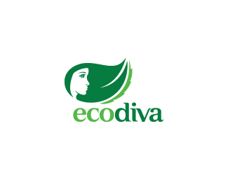
Description:
Eco-friendly skin care products. Working on finalizing this logo. I need your honest feedback on this version. Which do you prefer?
Status:
Unused proposal
Viewed:
14336
Share:
Lets Discuss
The simplicity of original is better IMO. I do like it rounded on the left side tho.
ReplyGreat, that's exactly what I needed to hear, Roy. What about the leaf shape? Better pointing down or going up like it is here?
ReplyGoing up, Kev! :)
ReplyNot sure but downward it nestles into the type better.
ReplyThanks Alen. I've been staring at both versions, and I'm leaning towards the leaf pointing down. Mainly because of what Roy said. The flow is a little easier on the eyes. Thanks to you both!!
ReplySorry for not sharing my argument - if the leaf points up it looks more dynamic and energetic to me, but at the same time it refers to the small caps 'e' (first letter of the brand name)... Those were my reasons... %3B)
ReplyThanks for elaborating, Alen. Your feedback is of much value to me. I can see what you mean about the lowercase e and how the bottom tail of the e curves up. I'm on the fence. :-)
ReplyI like the simplicity of the old one better. Seemed to flow a little bit nicer and had an overall cleaner look to it. They're both good though IMO.
ReplyThanks for chiming in, Joe. I've sent on the updates to the client. Now we wait. :-)
ReplyI agree with firebrand and momentum. The rounded leaf completes the curviness of a head shape, but I think it would work better facing down. Aside from comfortably fitting in with the type mentioned, I think that its a more natural position for the hair to fall in.
ReplyNooo!! my opinion fails...
Reply%5E%5E LOL!! You're hilarious, Chad. I sent the updates with the hair/leaf pointing down. Very good point about it being a more natural position for the hair to fall in. Thanks man!!
ReplyI do think the serrated edge is nice. If it doesn't get used in the logo, it will definitely be a part of the brand. I'm going to put together a few more minor variations and see what happens. Thanks guys!!
ReplyI like this one but without the serrated thing like this rounded one and hair up because it looks more like wind IMO and has a nice uplifting feel.
ReplyI prefer the corrected first one.
ReplyKev, you are right - it is all subjective. Let's all agree to disagree. :)
ReplyThanks Mike. Client opted for the other version with the leaf/hair going down. I still prefer that version as well. %3B-) We also decided to remove the serrated edge as we thought it was competing for attention. :: Thanks Milou! Me too. :: Okay, Roy. Agreed. :-) :: David, yes, run and hide. I've got a missile pointed straight at you. Oh crap, I hope I don't end up on the terrorist list now for saying that.*
ReplyThe leaf pointing upwards is the go, when I see profiles of the human face (no matter where the eyes are positioned) my brain says %22look up%22...**That little section of the jagged edged leaf is icing on the cake!
ReplyGlad to hear your rationale, Josh. Thanks for chiming in. :-)
ReplyP.S. The final design can be seen here. http://logopond.com/gallery/detail/79383
ReplyPlease login/signup to make a comment, registration is easy