Description:
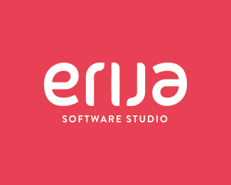
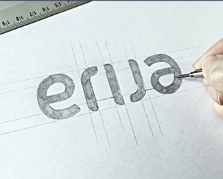
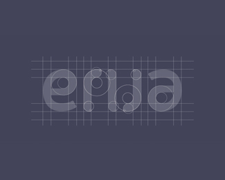
Custom ambigram logotype for a Brazilian software studio called “erija”. During a great period of working together, we decided to go with a modern, friendly and unique custom typeface. Friendly by the round corners, modern by it’s looks and unique due the fact of rotating the logo and see exact the same.
As seen on:
http://drbl.in/mJfl
Status:
Client work
Viewed:
7674
Tags:
type
•
typeface
•
font
•
fontface
Share:


Lets Discuss
great solution!
Replyvery cool!!
ReplyThanks for the kindness!
ReplyThis reminded me of one of my piece long ago:
Replyhttp://logopond.com/gallery/detail/8915
But yours is different name and much better execution. Nice work!
Yeah, I thought this looked familiar but in a slightly better way.
ReplyYour shift always starts when mine is done Chan... like two boats. I bid you farewell.
"...like two boats..." Are you getting all nostalgic on me Navman?
ReplyOr are you referring to my 'boatpeople' ancestry?
Careful now ;-)
Ha!... Boatpeople ancestry here too.
ReplySo both ;)
@chanpion @nido Hey! Honestly didn't saw yours before, funny to see it though. All credits for the idea are for the client himself, maybe he saw yours. We also considered using dots on the top and bottom of the "i" but the overall didn't looked better with it. Thanks for the kind words and the notice!
ReplyOh the old " Honestly didn't saw yours before, funny to see it though. All credits for the idea are for the client himself" story... if I've heard it once...
ReplyKidding. No one's saying you have anything to be worried about @paulvonexcite. You did well.
Like it. Nice work.
ReplyPlease login/signup to make a comment, registration is easy