Description:
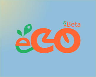
Work in progress for bycicle deliveries project. Please comment on possible improvements.
Status:
Work in progress
Viewed:
850
Tags:
ecology
•
bycicles
Share:
Lets Discuss
My first comment would be that your logo colors clashes with the background colors. I think that your leaves are original. I haven\'t seen any leaves as such yet. I like them. The little icon by the Beta is too small to see. I am not understanding the connection of the c and the o and the little \"tail\" inside the o, was it meant to represent a bicycle? I think overall with a little bit of tweaking here and there, this could result in a great logo idea. Cheer!
ReplyThanks for the comments I didnt realise you had posted it as I was only checking the design critique thread that i had posted.
ReplyThe background represents a clean blue sky as I wanted to convey eco-friendliness but I wasnt too sure about it staying, i knew it went well with the orange or so I think but there was something that felt wrong i just didnt know what it was, so maybe its the green and blue clashing?.
The beta icon wont stay long so im not too worried with it (it was meant to represent a small orange tree in a pot in case you didnt see it properly). As for the C and the O yes you got it, its a bycycle of sorts, C: Backwheel forks, O: Front fork, as for the e: cargo trailer carrying an orange. Its all meant to just give that idea while using the E, C, and O. not to be a perfect representation. Again thanks for the tip and the critiques.
I quite like the idea behind this logo. I get it\'s meant to look like a bike, do they use little trailers? If so then the e (of eco) is very nice, if not doesn\'t matter too much.
ReplyI reckon you could make it look a little bit more like a bike and the word eco but I can\'t really think how, not much of a designer myself!
The beta bit... presumably this will not be beta forever, in which case what becomes your handle bars? Because you might want to use that as an opportunity to further bike it up a bit. The beta and plant pot don\'t do much for me.
Hi barricades, thanks for the comments.
ReplyYes the e represents the trailer I use for this little venture. It is my own business. The beta is gone now. I guess there wont be any handlebars unless i could come up with a very good solution or inspiration. I was hoping to get some tips on how to give it a boost on the presentation side like background colour or any shadowing or light effect to give a finishing touch to the existing concept.
^^Agreed. Get rid of Beta, or at least change the color and drop it to the bottom. No reason for it to be on top of what\'s more important, and don\'t associate it with the mark. Having you considered making just a mark of a bike, and then a custom type for the name of the company?
ReplyPlease login/signup to make a comment, registration is easy