Description:
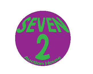
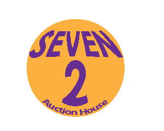
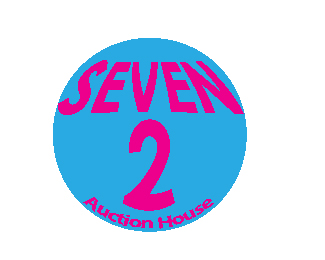
Tried to make it 60's looking, but I got confused on the color choice. I'm pretty sure i could use some other color than these ones, but i don't think there was a solid enough color from the 60's to be a logo.
Status:
Student work
Viewed:
1032
Tags:
Seven-2
Share:

Lets Discuss
i do really like the idea of this, good thinking. i think i like the orange ball but I'm not sure about the orange in it, maybe one of the other colors. but i like the thought process on this one.
Replyi just can't see this as a logo. nothing really going on, i don't see the retro vibe, it just looks like words balooned up. i think if you want to keep the element of the circle there would be a lot you could do with it. i like the orange and purple combos.
ReplyHello Phantom! Are you creating your logos using a vector program? I only ask because these don't look like vector shapes to me. :)
ReplyI did talk to him and the problem is when he loads it into PS, it stretches it and it becomes like that. I gave him some ideas that may help when it comes to fixing that problem.
Replyare you guys using MS Paint?
ReplyHe should be using Adobe Illustrator to create the logos in my opinion. I've never opened a logo in Photoshop and had it turn into that.
ReplyThen you can blame it on the instructor. That is how he told him how to change the image size after using illustrator.
ReplyIf he used Illustrator and resized it in Photoshop, it wouldn't suddenly look like it was made in MSPaint. So, there has to be something he's doing wrong.
ReplyMore than likely.
ReplyPlease login/signup to make a comment, registration is easy