Description:
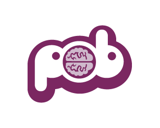
The design is for my website ‘POB’ or ‘piece of brain’. I wanted it to be a very simple, funky, single pantone colour design which would lend itself to printing and screen-prints. I specifically wanted the ‘O’ to look like a brain. Please let me know your thoughts on this and how you would go about improving it! Thanks.
Status:
Nothing set
Viewed:
1729
Share:


Lets Discuss
I thought that it was a rabbit head, or two... but it's a nice mark overall and for my taste, the stroke is a liitle too thick! good lucK!
ReplyI agree with bogdanv. To me it looks like a bunny that is tied by the brain or something. It's not a bad illustration though.
ReplyThanks for your comments! It's really interesting to see what other people can see...as when I draw logos, I'm very careful as to what else it can look like...but I'd never visualised it as bunnies! Funny thing is...when I look at it now I can't see it as anything else! I'm gonna try and do loads of very different versions, to see which one suits my ethic.
Reply@pob I'm very interested in a similar design as this POB logo for my artist profile. If you still get these messages, can you let me know if I could use it? I see this was made 10 years ago, but hoping there's still a chance you get Logopond alerts -- Thank you, Patrick
ReplyPlease login/signup to make a comment, registration is easy