Float
(Floaters:
17 )
Description:
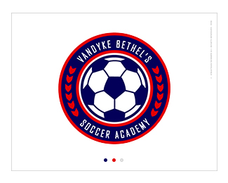
Logo for an client's soccer school/academy.
Status:
Client work
Viewed:
5580
Share:




Lets Discuss
looks clean. i dont know if you need the extra skinny white line around the soccerball. maybe just go from the blue border of the ball to the red for a simpler look? regardless looks great!
ReplySolid work thought I feel the type is weak. Bigger bolder would be my preference.
Replywow. just got it, very subtle!
ReplyI agree with mcdseven about the type- also it could be centered in the blue band a little better.
ReplyPlease login/signup to make a comment, registration is easy