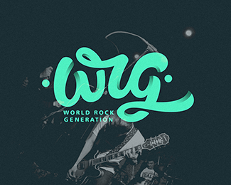
Description:
world rock generation
Status:
Client work
Viewed:
12259
Tags:
•
nickcooper
•
logo
•
typography
Share:

Lets Discuss
Nice way to do shading to give dimension.
ReplyIndeed! Nice work!
ReplyThanks!
ReplyAs mentioned before, this is really awesome!
ReplyVery nice composition and dynamics!
ReplyQuality logo design, great work!
ReplyLove your style!
ReplyThank you all!
ReplyClean and sexy, but i read "wig".
ReplyI love the colours. It's so smooth and clean but I agree with wizemark, I read it as wig, not wrg.
ReplyVery nicely executed !
ReplyPlease login/signup to make a comment, registration is easy