

Description:
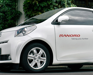
Ranoro modern, bold and dynamic brand is FOR SALE including RANORO.com domain.
As seen on:
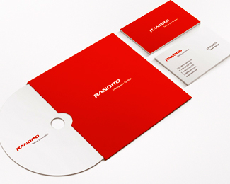
See whole visual style
Status:
Unused proposal
Viewed:
13072
Tags:
visual style
•
branding
•
brand
•
BRAND for SALE
Share:


Lets Discuss
is it because of kerning issues you have tucked the N in behind the A?... I cant help but think it would be stronger if it wasnt... its a strong looking type and done well... the hidden N weakens it imo..
ReplyWell, updated version uploaded. Thanks for thought nido :)
ReplyLooks better now, nice suggestion by nido.
ReplyDoes indeed. Hail nido!
Replynido saved the day :) :)
ReplyNice one oski
ReplyThank you !mude.
ReplyWhat is Ranoro? Great logo.
Replyniceoski
ReplyYeah cool type Oski!!
Replynice logotype %3B)
ReplyThank you guys I am glad you like it! Jonnyd: description updated.
ReplyStrong and powerfull!!
ReplyVery nice logotype!
Replylikin it
ReplyVery strong! Congrats!
Replygreat typo, strong and dynamic as you said
ReplyYes, nice typo treatment.
ReplyGreat type work!
Replygreat job mate .Excellent and sharp typography ..
Replyvery nice work congrats:)%0D*%0D*
ReplyReally love the little details that make this work. Great job!
ReplyThank you very much to all for such a words!!
ReplyI agree with Nido, the start looks slightly to close together. Its a cool style though.
ReplyStill looking great
ReplyWhat font did you use?
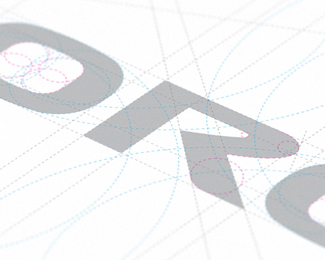
ReplyThis is custom and original type no font used.
ReplyPlease login/signup to make a comment, registration is easy