
Description:
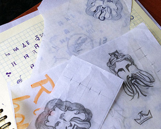
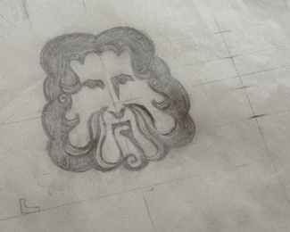
still working on his face)
what you think?
Status:
Work in progress
Viewed:
7378
Tags:
head logo
•
poseidon sea
Share:

Lets Discuss
good work ..love it
Replypalattecorner thanks, the client choose this way
ReplyYou are a real hard worker :)
Replyru_ferret )
ReplyI will try not to drool over this one...
Reply... i failed.
ReplyVery sweet design!
Hardwork!
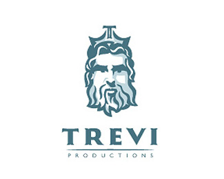
ReplyLove the icon! It looks a little off-center to me though. I think it's because the beard is swaying a little to the right, it throws off the symmetry and looks like its pushing over to the left as a whole. Although it might be mathematically centered, I would nudge the icon a tad to the right to optically center it. I wonder what it would look like if the face (hair and beard) was perfectly symmetrical. It might centralize it more.
ReplyGreat Job!
LittleGuyLogos, ricardobarroz, aalok89
Replythanks
congrats on the g spot, rait.
ReplyColinTierney ) thanks
ReplyWell done!
ReplyGreat job...I want one just like it!
Replyreally nice face! love it
ReplyPlease login/signup to make a comment, registration is easy