Description:
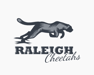
Logo concept for Raleigh Cheetahs baseball. Inspired by the style of Gal.
As seen on:
Raleigh Brands
Status:
Unused proposal
Viewed:
2585
Tags:
baseball
•
sports
•
animal
•
cheetah
Share:




Lets Discuss
Need to spend more time on the typography for sure.
ReplyThe headline typography isn\'t bad, it\'s bold & tough looking, which is what you want for a sports team, a few little kerning trouble spots though; RALE is very tight & IGH is quite loose. The \'Cheetahs\' type looks like an after-tought though.
ReplyI really like this. Something about the Cheetah\'s left front leg is bothering me though and I can\'t quite put my paw on it. =P (See what I did there?) I think maybe it almost too closely resembles a hoof?
ReplyThanks for the feedback everyone. I agree with it all and will revisit this design soon.
ReplyReminds me of Gal\'s style, which i see is intentional lol
ReplyPlease login/signup to make a comment, registration is easy