Float
(Floaters:
23 )
Description:
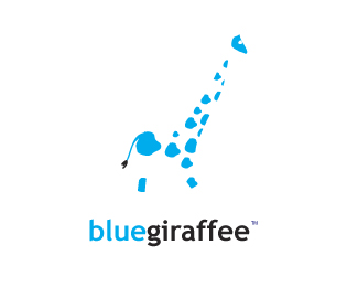
proposal for blue giraffee. a giftstore and handicraft.
Status:
Nothing set
Viewed:
11873
Share:
Lets Discuss
like the mark and color.%0D*tail is having black looks odd.%0D*what abt the head?%0D*%0D*logo for what? then only can get the clear picture abt the logo.%0D*
Replyit's made in a sery(?) of four.%0D*There is also one with the body and head but this one looks best for logopond in my opinion.%0D*%0D*it's a store selling gifts and handicraft%0D*
ReplyI think is a good idea, but it feels incomplete without the head.
ReplyI agree it needs a head. Is there a reason that giraffe is spelled wrong? (I don't mean the griaffee in the title.) Is it the name of the store owner or something?
ReplyThe head can go inside the shop and hide it. or inside the window.. some more details required for girafee without head. then only this work will be complete.
Replygiraffee is the name of the shop, yes.%0D*%0D*Let me see if it works better with a head. It's just that on the other giraffe these spots are yellow/orange on a blue giraffe (with head), didn't consider that a head was missing.
ReplyI like how the spots create the shape of the giraffe
Replywhy people are saying there's no head? The head is the bigger blue spot on the top, right??? And the little white spot it's always an eye....for me, anyway!**I like it! :)**
ReplyI like the idea, although I agree that the giraffe needs some tweaking.**Did you consider a different font? This would be a great place to use an ff ligature!
ReplyI think the concept is sound it gets across the idea of the craft shop. the graphic just appears slightly too disjointed and hard to focus the eye on the larger picture. tighten it up and it should give a clear image but will still retain the asthetic of being craft related. Really good idea by the way.
ReplyPlease login/signup to make a comment, registration is easy