Description:
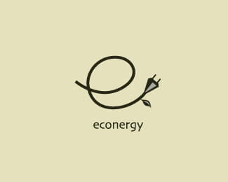
logo for a new project that will produce clean energy that protects the environment, by using organic wastes
Status:
Nothing set
Viewed:
10507
Share:

Lets Discuss
Thanks Anthony , Glad U like it.
Replybeautiful...
ReplyGood one %3B)
Replynice
ReplyLove this one Rincon.
Replyawesome...
Replythank you guys for the kind words, I appreciate it
ReplyI like it, but may be tringle insiede is redundant%3B)
Replyvery nice work, mate!
ReplyI hope that you won't get me wrong, just wanted to share my first impression here. Structured this way I didn't FEEL the energy part at all. I know that it's hidden in the message of the power cable but if you just analyze the visual composition, it reminds more of an dry and old branch in the middle of the autumn with just one small and dry leaf hanging down from it (I know that it uses the waste but why showing it?)... Brand name such as Econergy (Eco ENERGY) should be bursting out with the visual energy man! Leaf shapes, colors, light, sun !!! Bam, bam! *Now, you did a good job here when it comes to execution of the concept you had in mind, no comment there, hats down. But just wanted to share my thought on being this a logo for a brand name like that one... No hard feelings?
ReplyHey Type, is difficult to find people who tell the truth as they think is it, thanks for being honest, I really appreciate it, thanks, it's a good point that you bring, let's see , I promise I%B4ll think out
ReplyХCEрCEшCE %3B)%0D*
ReplyWell %3B)
ReplyThis is good, Rincon!
ReplyThe subtlety here works really well. Could work even without the leaf, I know that wouldn't show the 'eco' side in the icon but the name 'econergy' is surely enough. Just an idea.
ReplyHi Ricon*I really like this one.*Is is possible to talk to you on phone, we need a logo for our non profit organization, and the idea we have is very closed to your design, and we like to ask you to draw one for us.*you can email to [email protected]**Thanks*
ReplyVery nice!
ReplyPlease login/signup to make a comment, registration is easy