Float
(Floaters:
35 )
Description:
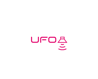
UFO is a music shop. The UFO's logo represent the speaker's icon and an UFO.
Status:
Nothing set
Viewed:
8513
Share:


Lets Discuss
I love this logo. Great concept and use of a common symbol in a new way. **One thing you might want to consider is tying the look of the icon and type together. Right now the icon has a lighter line weight and square corners whereas the font treatment is heavier and rounded.**Nice work.
ReplyWhile I agree with secondtoughest about the line weight of the speaker, I think if you round the corners it will be very hard to give people the idea of a speaker unless you tell them the store is a music shop.*My thought is that giving it rounded corners will inevitably make the speaker look more like an alien ship, and that thought is already there because of the text. The thought that really needs to be accentuated is the speaker.
ReplyGreat job! So nice...
ReplyHow clever is that? I agree with the above comments, other than that... Superb.
Replygood idea- I love the simplicity.
ReplyYeah, I agree with the rest. Make the line weight heavier on the speaker and you should be just about right! Good use of a familiar symbol.
ReplyI agree with all of you.
ReplyExcellent concept, Rueeasy!!
Replygreat concept.**i'd make the weight of the lines on the mark as thick as they are on the type.
ReplyI agree with firebrand on the weight of the lines.. otherwise this is very nice.
ReplyIt is indeed a lovely designed logotype. Though as a few of the comments above, before I read which type of business the logo was associated with, I saw a space ship, then thought maybe it is a lampshade with light rays underneath and it could be a cool brand of lampshades. Nevertheless, again, a lovely logo on the eyes.
ReplyThis definitely gets filed in the 'wish I'd thought of that' category. Brilliant.
ReplyThis is just brilliant!!!
ReplyThis is really nice! Great concept my friend.
ReplyClever idea!!!
ReplyDon't like the pink, but cool.
ReplyPlease login/signup to make a comment, registration is easy