CutClass
by SKitanovic • Uploaded: Oct. 04 '17 - Gallerized: Oct. '17
Description:
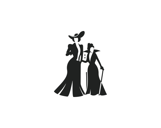
Negative space logo designed for fun. I was working on some project and saw this negative space potential for a knife between two ladies, and this idea haunted me until I made this logo.
The name is a wordplay. Cutlass is a bladed weapon, and I combined it with Class because... well, look at the ladies! :)
As seen on:
dribbble
Status:
Just for fun
Viewed:
3,389
Tags:
smart
•
logo design
•
logo
•
cutlass
Share:

Lets Discuss
You can make the right woman taler, the handle of the knife is quite short i think.
Reply@AndreasZaugg Thanks for constructive criticism bro, I appreciate it!
ReplyI have tried that, the thing is that if I make her taler, her right hand will go ''up'' as well, in that way handle stayed the same and the blade part was bigger, after that I've tried to change the position of her hand, but it felt ''unnatural'' somehow, so I decided to "sacrifice'' the height of the woman of the right (granny), and the size of the cutlass handle to ''execute'' the idea. Maybe, I'll come back someday to try to develop this concept.
@SKitanovic I think it's key that her arm stays at the same hight. Negative space logos are indeed tricky. Many times we need to find some solution that compromises are not obviously visible or visible at all. Maybe the figures could be male wearing long trench coats, vampires for example.
ReplyI like where this is going but needs more working on, until it feels seamless, the negative space feels forced
ReplyPlease login/signup to make a comment, registration is easy