Description:
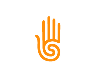
This logo represents my personal identity as a graphic designer. "Design to Feel" represents an attitude toward the process of creating successful visual solutions, where designs are more often judged not by how they look, but by how they feel. A modern re–imaging of the prehistoric hand/spiral motif fits my own design sensibilities and feels appropriate for myself as a designer. Simple and powerful.
As seen on:
SamDeMastrie
Status:
Client work
Viewed:
13989
Share:


Lets Discuss
I think this is very nice. Have you seen the Siah Design logo? Might be worth intentionally distinguishing from that.
ReplyThank you. I have not seen it. Do you have a link so I can check it out?
Reply%22feels%22 good.
Replyhoweya designtofeel, just came across while searching mr.google for something else, only giving ya the heads up and nothing else.... lovely work btw, flawless execution you have there.***http://www.surveillance.net.au/portfolio/images/logos480-DOS.gif
ReplyThanks ColinTierney and mcdseven (sorry I'm new, don't know anyone's names), I appreciate the comments. **Thanks for that link. I got a little nervous when I first saw it, but I quickly realized they didn't put in the hours that I did! Interesting none.the.less.
Replyhttp://siahdesign.com/%0D*http://logopond.com/members/profile/showcase/9033%0D*%0D*It is actually a bit different now that I look at them, but when I first saw yours, that is what I thought of FWIW.
ReplyI have no idea what FWIW means, but thanks anyway lumavine. :)
Replylooks similar the Teva hand. (www.teva.com)
ReplyFWIW %3D For What It's Worth
Reply@straycloud: Wow, it is pretty similar. Complete coincidence though, I promise.
ReplyThis logo recently received an Award of Merit in the Salt Lake City AIGA 100 show!
ReplyMy congratulations!:)
Replycongrats :)
ReplyWell deserved. Next award - LP gallery :)
ReplyCongrats! Why isn't it in the gallery?
ReplyThanks people.
ReplyWell done ! Congrats on your award.
Replyhttp://www.donaldegray.com/***Ran across this today randomly. I know it's a common shape and all, but it definitely made me think of you!
ReplyMan, these similar marks keep piling up. Fortunately, it seems like all of them are a one-way spiral that ends in the palm. I don't think I've seen another like mine that comes in from the thumb and out to the fingers.**Thanks, Nathan.
Replyyeah, I agree that yours is definitely different (and better)! And the proof of this is the fact that when I saw that other one on the mentioned website, I instantly thought of that guy on Logopond! %3B)
ReplyAha! Success!
ReplyCool...
Replyvery clean, i like when it's clean
Replywow nathan that other one you found is almost identical, but I too prefer this mark. Well done man!
Reply!congrats!
ReplyPlease login/signup to make a comment, registration is easy