Description:
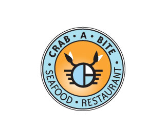
Seafood restaurant concept (more so like a fast food joint) revised from original done way back in 2000.
Status:
Nothing set
Viewed:
3015
Share:


Lets Discuss
Cool idea. I like the stylized crab - feels kind of Frank Lloyd Wright-ish. I would fix the type though. It's not conforming to your circle.
ReplyThanks sdijock! I updated a revised version.
ReplyMuch better.
Reply@ sdijock - Is the line work inside the crab supposed to be the letters 'C', 'A' %26 'B'?
ReplyYes! Its a very abstract 'C', 'A' %26 'B'. Glad you noticed it :)
Replythis logo feels neglected. feedbacks appreciated. thanks :)
ReplyNo longer neglected. David went way back to bring it up to the gallery.
ReplyI realized, thanks you guys! :)
ReplyPlease login/signup to make a comment, registration is easy