Description:
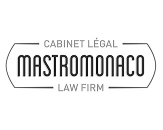
The Mastromonaco law firm was getting prepared for a new partner and a handing over of the company to the younger generation coming in. The client was adamant about having a logo free of clichés often found in law logos (not that I really wanted to make a cliché logo). The other major pressure point of the design was the length of the company’s name. The client also wanted the logo to exude approachability and youth.
I kept the design masculine and confident and used a modern. The logotype uses a condensed display font to reduce length of the company name. The rounded shoulders soften the overall look and feel without taking away from the masculinity of the design. The overall approachability conveyed by design is reinforced by the light weight of the font.
The secondary font is a classically geometric sans-serif which adds to the masculine feel as well as minimal and modern quality of the design. It has been sized to be legible in small scale without visually overpowering the Mastromonaco name.
Both fonts are sans-serif with the intention of avoiding the cliche of serif font usage in designs related to law, and as per the client’s directions to void such cliches.
Thin and minimal framing contributes to the balance of the design without crowding or conflicting with the rest of the design. The framing combines the use of rounded and straight lines to further convey the balance between masculine strength and non-threatening approach. It also brings focus to the center of the logo and clearly defines the boundaries thereof.
The colour scheme of the design is consistent with the masculine look and feel of the logo. An overall greyscale palette is used with a slight touch of colour given by using a desaturated navy blue.
As seen on:
Sasha Endoh Design
Status:
Client work
Viewed:
1078
Tags:
clean
•
modern
•
Montreal
•
legal
Share:


Lets Discuss
Please login/signup to make a comment, registration is easy