Description:
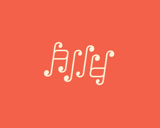
For practice and fun. An ambigram for my 8 year old daughter, Ally. Suggestions welcome, it's just an experiment and it's my first foray into an ambigram. Is it readable?
As seen on:
Sean Heisler
Status:
Just for fun
Viewed:
3841
Share:


Lets Discuss
Nice one Sean! A little hard to read, but then again ambigrams aren't always the easiest to decipher :) Love the colors.
ReplyThanks, Joe! Appreciate the comment, getting scared there that this was a total failure! :) I agree, ambigrams are a bit of a challenge to read most of the time but that's part of the fun in unlocking the word. You just need to cross that line from total wreck to somewhat legible, and offering the ability for most to get it - and I hope I'm there. :)
ReplyI am quite fond of this. Nice work.
ReplyI red easily and i believe your daughter is very lucky to have this beauty :)
Replyagree with all, it looks great!:)
ReplyThanks so much, gents! She really likes it a lot. She's the artist among my three kids and she's excited about it.
ReplyYour daughter is 8?! Great logo, grandpa! LOL :)
ReplyHa! I'm not quite THAT old.
ReplySean needs his reading glasses to see all the nice comments :P
ReplyGreat work Sean. Just wondering how would it look with the crossbar on the %22A/Y%22 curved upwards?*
ReplyUpdated. Roko, thanks. Funny you mention the cross bar, that's the one area I keep fiddling with. Is this kind of what you were talking about? I like it, I just didn't know if the Y was more confusing or not. That's why I ultimately went with the straight bar. It is even more festive this way. The straight bar really made the characters look like musical notes too, which isn't a bad thing at all, but not really my conceptual intention.
ReplyHa! Joe, I just caught your comment, after leaning in and squinting.
ReplyLooking good Sean. Yes, I was thinking something along those lines. *Does your daughter play any musical instrument? If she does, go with the straight bar. It would sure look good as a sticker on her guitar:)
ReplyNope, wasn't intentionally going for something musical but it has that bubbly feel. I tried something different again. The extra couple round serifs I added in the last revision made it feel like there were way too may little round serifs going on, so I'm back to the straight bar - but with a little curve on one end which I think helps some.
Reply%22...but with a little curve on one end which I think helps some.%22*It definitely does. Once again, delicious ambigram.
ReplySean, first, or tenth, they don't get any easier**She's going to be the coolest kid in class for sure - like, c'mon, your own ambigram!****
ReplyHa! Thanks, Raja!
ReplyWow really great. I didn't immediately think it was an ambigram, which is good because that usually means a particular illegible style with glyphs shoehorned into upside down death metal versions of themselves that screams ambigram. But this is very pretty!
Reply%5E Ha ha ha, great description! :) he he Thanks for the comment!
Replyit is quite hard to read but I don't care, beautiful!
ReplyHey, Rich! Thanks. Awe, come on, easy to read! :)
ReplyLovely and musical ambigram. Nice job mate.
ReplyThanks, Jovan!
Replydelicious!
ReplyThanks, David!
Replylooks great !
ReplyThanks, Bernd!
ReplyLooks beautiful,Sean!
ReplyThanks, Shyam!
Replyi hope one day ally appreciates this as much as i do.
ReplyMissed this, Colin, thanks buddy. She still likes it a lot! :)
ReplyNice thing, but without knowing beforehand what we're supposed to read there, the letter shapes are not readable, sorry.
ReplyThis is readable & cyte ambigramm
ReplyPlease login/signup to make a comment, registration is easy