

Description:
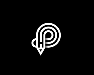
Logo from my Initials letters PH ( Peter Had ) and pencil
Status:
Work in progress
Viewed:
1756
Tags:
initials P H pencil
Share:


Lets Discuss
skorpy ??? oh no ... skorky ... good work !!
ReplyThanks TAS
ReplyThe only part of this that isn't consistent with the rest is the gradient/shadow. I think it would look better without it.
ReplySamdemastrie is spot on with the gradient, also I think if you lifted the bar on the H it'd make it more obvious, I didn't see it until I read the description and was looking for it.
ReplyBut it's a really pretty mark, I like it
I think both elements have just the right amount of influence. Great work.
ReplyPlease login/signup to make a comment, registration is easy