Balance equine
by Shalamanov • Uploaded: Jul. 14 '15
Float
(Floaters:
13 )
Description:
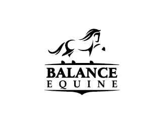
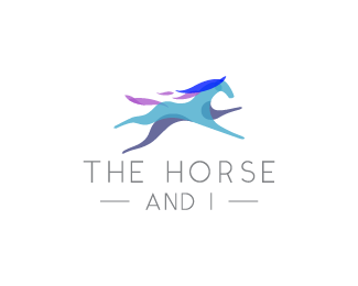
Horse logo created for equine massage, unused proposal.
Status:
For sale
Viewed:
2,986
Tags:
mark
•
equine
•
horse
Share:
Lets Discuss
Very nice horse. I dig the minimal shapes. Gets a little busy at the raised leg.
Replylove, love, love the horse! I think the word Balance is waaaay too heavy though. as a general rule I try to keep font widths around the same average weight as the illustration I'm doing. if the font is wider than the widest areas of your illustration, I find it pulls the whole design down.
Replyas much as I love the horse illy, I'm not sure it goes with the name of the place. when I think of a horse and the word balance, a horse standing stock still, even with a raised leg, does not come to mind. a rearing horse, or even a trotting horse (because of their symmetry), or perhaps a horse with a rider hugging the horse's neck all come to mind first before a standing one.
love, love, love the horse illy, though. really. I hope you find a home for it!
@logoboom, @THEArtisT Thanks for the nice critiques, I really appreciate that!
ReplyGlen, I agree with you about the raised leg there's still some things to be fixed on this one.
Thanks Trish, this beauty deserve a good home :)
Great horse
ReplyHey Oksana, thanks a lot! :)
ReplyWow great horse!
ReplyThank you Alena!
ReplyPlease login/signup to make a comment, registration is easy