Description:
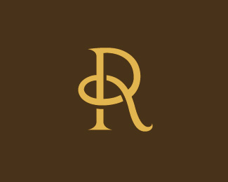
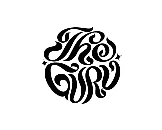
Wine farm in Paarl, South Africa, that specialises in weddings - hence 'tying the knot'.
Status:
Client work
Viewed:
7144
Share:
Lets Discuss
Beautifully stellar! Such good lettering!
ReplyThanks Lumavine. The logo was designed to sit far apart from the farm name (cause it's such a mouthful), but I had to squeeze them together to fit the LogoPond rectangle. Great client to work for, because they took a giant leap from their old logo, which was very twirly and old-fashioned.
ReplyThanks snd! I think I'll remove the type - let the mark breathe.
ReplyLove the typing the knot idea, so subtle. Well Done Simon... loving your work!
ReplyOooops typo... I meant tying lol
ReplyLOL. Thanks Mr Orange!
ReplyMy favorite letter:) Nice work Simon.
ReplyLol..Miss Orange %3B)
ReplyGreat monogram Simon!
ReplyI can totally see an A. Lookin' good, man!
ReplyI meant an A %3Cb%3Etoo%3C/b%3E. (just saying)
ReplyThanks everyone for the cool comments. %5E Ah. Lecart. I see it too now!
Replyanother nice concept and execution, Mr. Simon.
Reply%5E%5E%5E%5E%5E%5E Sorry, ma'am! %3B-)
Replyfirst time I see this....was like...weeeeoooouuuww.....haha.*I like it
ReplyPlease login/signup to make a comment, registration is easy