Float
(Floaters:
28 )
Description:
Design studio
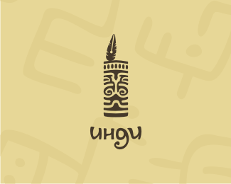
«Indi» from Indians and, a little bit form «In Design» )
Status:
Client work
Viewed:
1850
Share:

Lets Discuss
Very nice. The mark and type go well together.
Replycool mark
ReplyOcularInk, I've tried )**Thank You.
ReplyDidn't notice the nib in the feather right away... nice.
ReplyAgree with Rincon.
ReplyThank You all
ReplyAwesome.*Is the feather supposed to represent a calligraphy pen?
ReplyNo. I tried to present the picture as woodcarving.
Replysorry for my english. I don't understand you correctly ) **yes, you're right it maybe a calligraphy pen or a fountain pen. *
ReplyThanks *I am not a logo designer, rather specialised in web**so i will be thanfull for all advices:)**Your version is more %22logoable:)%22
ReplyPlease login/signup to make a comment, registration is easy