Description:
Really want critique. I can't ever make things for myself that I like.
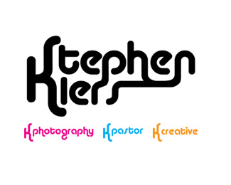
The first part of the logo would be used on its own a lot. Examples of its use are below the logo.
thanks guys!
New website and full identity coming soon...
As seen on:
Stephen Kiers
Status:
Unused proposal
Viewed:
1428
Share:


Lets Discuss
Would love some comments, critiques.... although I guess everyone looking and saying nothing means it is mediocre. Nothing bad to say, but nothing good either?
ReplyI like the concept (of having one %22look%22 for different applications), but I'm not completely sold yet.**I like it in actual use (K photography, K pastor, K creative), but I think the %22Stephen Kiers%22 should be cleaned up a bit.**A few ideas:*1) Don't have the %22s%22, %22h%22 and %22n%22 all bleed into each other*2) Consider removing %22Stephen%22 and just having %22Kiers%22*3) There seems to be too much space between the %22r%22 and %22s%22 in Kiers.
ReplyYay, a comment... and one with opinions!!!!
ReplyPlease login/signup to make a comment, registration is easy