
Description:
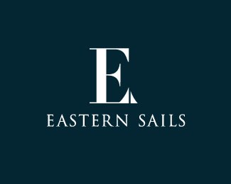
The serif of the capital E is modified to look like sails creating a unique sailboat monogram
As seen on:
N/A
Status:
Just for fun
Viewed:
2565
Tags:
stylized
•
elegant
•
negative space
•
sea
Share:

Lets Discuss
Don't get the circular bite out of "E" bottom...
ReplyI took the bite out of the E to make a negative space sun I took advantage that the typeface had was very straight at the end to almost make a horizon line , but it seems a bit of a stretch , what would make this logo better?
ReplyEven after you said there is supposed to be a sun, I still don't see it. Maybe, my brain doesn't feel there is enough information to make something out of this negative space.
ReplyInstead E is looking like an F.
So pablo should i get rid of that circular bite?
ReplyPlease login/signup to make a comment, registration is easy