Description:
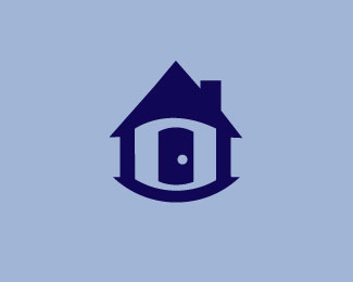
Ios app logo/icon for a mobile neighbor hood watch patrol. The door is used to make the eye.
As seen on:
N/A
Status:
Just for fun
Viewed:
1776
Tags:
•
green
•
watch
•
patrol
Share:


Lets Discuss
You have some good theme continuity going on here. The 'fish eye' curve of the icon looks great overall. I might bring the gable to more of a complete point rather than plateauing it like that. Since you have sharp points, this should look alright and also bring the 'house' element out just a tad more.
ReplyThe only thing I have a major complaint about is the colors here. The mood isn't serious or official enough to represent a neighborhood watch, imo. If you're going for brighter 'safety' colors, maybe try a yellow or orange, but I would personally try for more of a navy/white combination or something otherwise more 'police'-like. Just my $0.02 Definitely nice lines!
I love the way you're thinking. Using the knob as the glair in the eye is very clever. However, I wouldn't have known that it was supposed to read as an eye if I hadn't read your description. Because of the "fish eye" effect, the house looks like it's a cylindrical structure, rather than a standard house. Maybe there needs to be a flatter bottom to the house? For me, the biggest obstacle keeping me from recognizing the "eye" is the hight of the vertical walls -- it disrupts the corner angles of an eye shape. Perhaps, if the walls were a bit shorter (as well as the door), it would help us appreciate the illusion you're aiming for. You're onto something! Keep up the good work. :-)
ReplyPlease login/signup to make a comment, registration is easy